Index
< Back

Investment Marketplace
10 min read . Sep 27, 2024

TL;DR:
Pershing’s fragmented investment centers created inefficiencies and inconsistent user experiences. I led the consolidation of these centers into a unified investment marketplace with freemium and premium features, based on in-depth user interviews, competitive analysis, and data insights. This redesign streamlined workflows, improved user navigation, and introduced a new revenue stream. The platform now offers personalized user journeys, resulting in 117 more clients adopting the marketplace.
Company
BNY Mellon
Year, Time
2021, 6 mos.
My Role
UX Lead
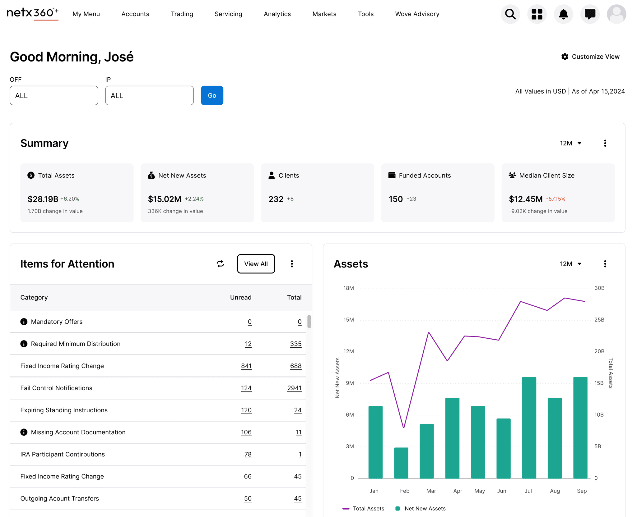
The What & The Why
Pershing’s platform contained multiple investment centers—Equity Center, Mutual Fund Center, Alternative Investment Center, Model Marketplace, and Fixed Income Center. Each center evolved independently, resulting in a fragmented user experience with redundant workflows. Advisors often navigated multiple centers without a unified journey, causing inefficiencies and confusion.
User needs also varied across product types and client profiles, making it difficult to provide a consistent experience. The platform lacked a clear strategy for streamlining the user journey or generating new revenue. Our goal was to unify these centers into a cohesive investment marketplace that not only streamlined research but also introduced freemium and premium features for advisors and portfolio managers.
Key challenges included:
Fragmented experiences across investment centers.
Duplicative workflows and inconsistent navigation patterns.
Difficulty in providing a unified journey for diverse user needs.
No clear strategy for monetizing the platform or offering premium services.
The How
Gathering Insights via User Interviews
Through a series of in-depth interviews with advisors who regularly interact with NetXWealth, we gathered qualitative insights into their daily processes and workflow inefficiencies. Our primary goal was to understand the current challenges and uncover problem areas the redesign should address.
Advisors
3
Total Minutes
180
Uncovered Blockers
32
These interviews revealed a number of unconventional workarounds and highlighted 32 key blockers. This gave us a clearer picture of the issues advisors face and where the redesign could provide the most impact.
Interview Findings
Exploring Market Gaps
The availability and depth of market research tools varied widely across advisor platforms. While some platforms offered robust research capabilities, others required advisors to conduct their research on external sites, using their advisor platforms mainly for portfolio management.
Insights from our user interviews helped justify the budget to hire a product consultant with expertise in investment marketplaces. Together, we conducted a comprehensive competitive analysis that complemented the user research, focusing on the features and strategies of leading competitors in the market.
Platforms Evaluated
9
Heuristic Themes
6
Competitors
7
Competitive Analysis Findings
Data Deep Dive
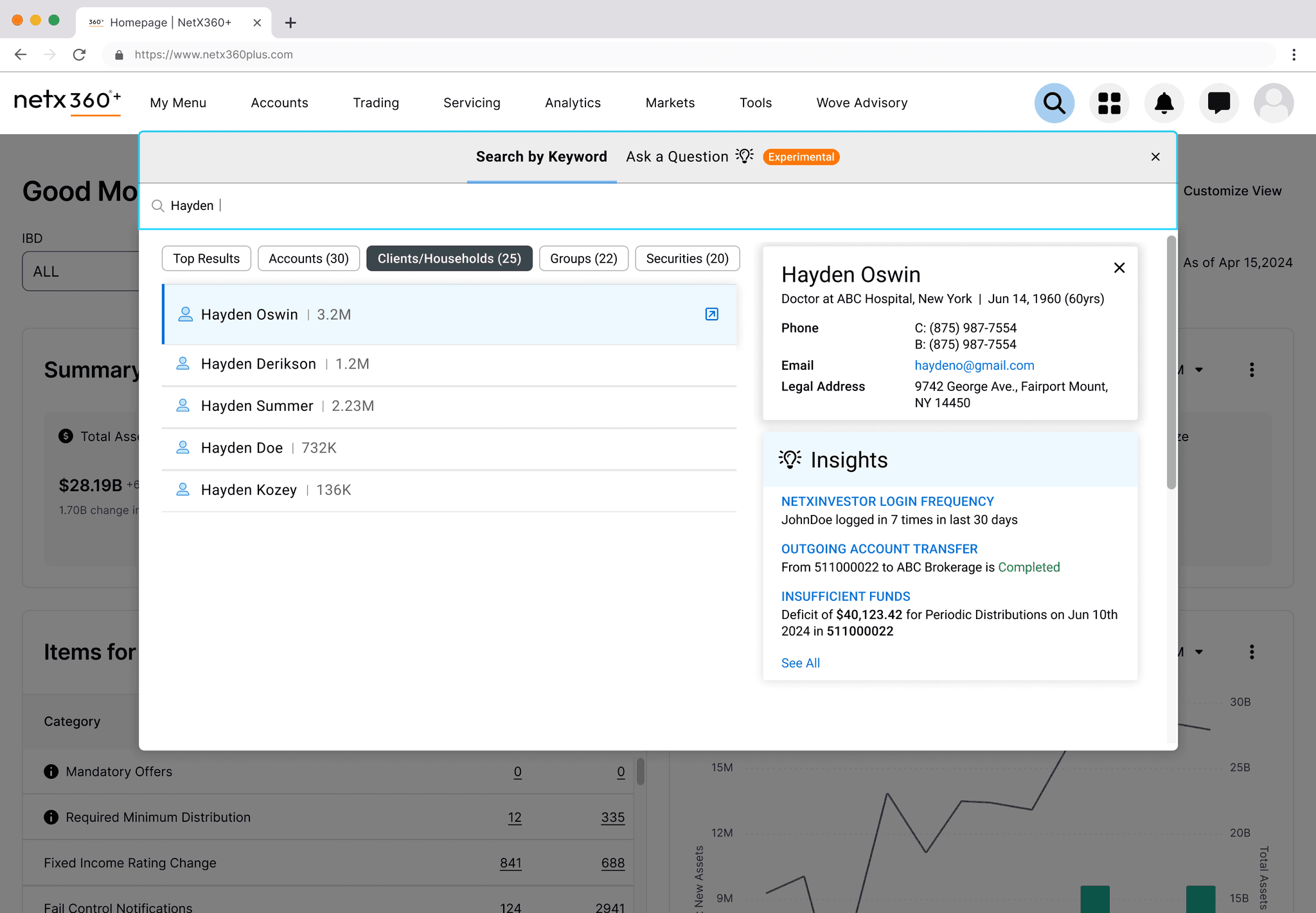
Through a combination of spreadsheets, SME Interviews, and deep-dive analysis sessions, we gained a clear understanding of where the current platform fell short and where redundant or missing data existed across different centers. Our goal was to identify overarching themes and gaps to direct our efforts during the design phase. We identified key opportunities for improvement, such as universal search, cross-product access, and streamlined screener experiences. These insights were critical for shaping the future experience.
Design Opportunities
Search across all asset classes
Landing page for all centers
Cross product access
Comparison tools
Cohesive screener experiences
Representation of partner content
Data Opportunities
Partner Content/Marketing material
Comparison data points
Fundamental data on profile pages
Screener criteria
Personalization
ESG/Equality Leadership Data
Data Analysis Findings
Shaping the Design
Mapping Jobs-to-be-done
Drawing from interviews with advisors and subject matter experts, we compiled a list of common jobs-to-be-done for investment research. This formed the foundation for mapping the platform's new design.
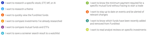
Advisor Jobs-to-be-done
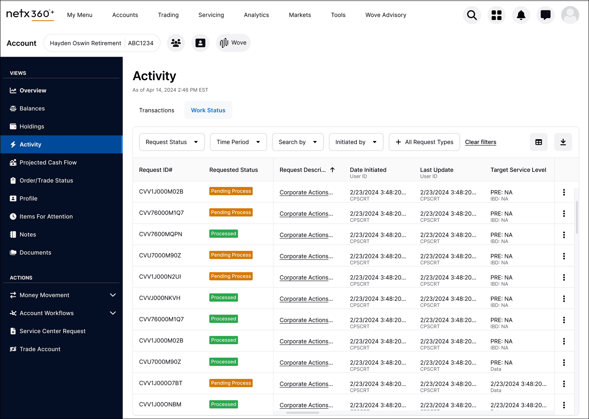
Streamlining Information Architecture
The current market research section was fragmented across multiple centers—Equity, Mutual Funds, ETFs, and Alternative Investments—with inconsistent navigation patterns.
From
CURRENT CHALLENGES
Inconsistent navigation caused fragmented user experiences.
Screeners were duplicated across centers.
Multiple ways to complete a task left users confused and lost.
To
UPDATED ARCHITECTURE
Organized tabs by task instead of investment type to reduce clicks.
Eliminated duplicate tools with clear filters.
Simplified navigation with a maximum of three layers.
Consolidated partner content for better discoverability.
User Journey within new IA
Crafting Design Concepts
We combined insights from interviews, user journeys, and architectural updates to identify new opportunities. Using wireframes, we conducted workshops with design and business SMEs to ensure consistent content organization across user flows.
Wireframes
We created a UI kit using NetX360’s design language and researched e-commerce and retail finance design systems to incorporate modern interaction patterns.
Design Concepts
Design Delivery & Validation
The entire journey—from research to design—took three months. The new revenue streams and redesign were evidence-based, motivating business teams to extend the design cycle before starting development. After validating the design concepts with users via unmoderated testing using Maze, we stayed two sprints ahead of development to deliver designs.
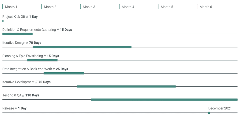
Delivery and Development Timeline
The Results
The new platform not only improved the user experience by reducing redundant workflows and simplifying navigation, but also introduced freemium and premium features, creating a new revenue stream.
100+ new firms adopted the marketplace within the first six months.
40% increase in user engagement across all centers.
85% satisfaction score from user feedback during testing.
Introduction of 3 premium services driving increased subscriptions.
What I learned...
This project reinforced the critical importance of using a blend of competitive analysis, data insights, and user interviews to create user journeys and information architecture that strike a balance between qualitative and quantitative insights.
Additionally, it underscored my belief that a thorough discovery process—if done correctly—sets the foundation for better ideation and ultimately leads to scalable, user-centered designs. By validating assumptions and uncovering hidden pain points, we were able to design a more cohesive and efficient experience for users while delivering tangible business value.
© Vivekanandhan Vijayachandran. 2025